
During holiday time, many struggles to pack their belongings into a small suitcase. What should you take? How to arrange things to make maximum use of the space? The same goes for designing responsive tables. Here are some tips on how to cope with the task.
Nowadays, responsiveness is one of the main requirements in website design. The growing importance of mobile devices and changing user habits make the idea of responsiveness impossible to ignore. The essence of “Responsive Web Design” is adapting a website to different screen resolutions and different devices – desktops, tablets and smartphones. When preparing a scalable page we can encounter all sorts of problems, such as navigation construction, content organization, scaling graphics and text. However, one of the biggest challenges to face when designing a website is the issue of creating scalable tables.
Tables are commonly encountered on pages of various sorts. In the case of eCommerce websites they accompany various products. They can be used for presenting a bid, contain product specifications or a list of available sizes and options. The challenge is to maintain easy access to data with simultaneous possibility of comparing information. Depending on the size of the table and its complexity, the transfer of data on a small smartphone screen can be like trying to push a watermelon through the head of a pin.
When preparing the redesign of a table you should focus on a few elements:
- what kind of a table it is, what does it cover and what kind of data is included in it?
- how much of the data is presented in the table?
- how much of the data does a user actually need?
- what are the technical limitations?
A downloadable table
One of the easiest ways to deal with tables on mobile devices is to transfer them to a PDF document that can be downloaded directly from the website. When a user browses the page on a big screen the table is displayed in full, but when the screen resolution is reduced to the size of a smartphone, the table is hidden and replaced by the link to a PDF file.
The advantage of this solution is its simplicity and ease of implementation. There is also no risk that the table will destroy the prepared responsive system. In addition, the whole thing can be made using simple media query scripts in CSS.
The drawback of using a PDF document (or other types of files, e.g. graphic) is to sending users to external materials. There is a risk that a user who leaves the page wishing to view the downloaded file won’t come back to it. Users may also – for various reasons – be reluctant to download the file. It is worth to remember to describe properly the link to the document. Thus, the users will know what they are downloading. Moreover, the file should not weigh too much (this information should also be part of the description). It is also not a particularly useful or building a positive experience way. From a technical point of view, this approach provides a quick solution to the problem, but requires a large commitment from the user, and a downloaded table will still be hard to read on small screens.
A scrollable table
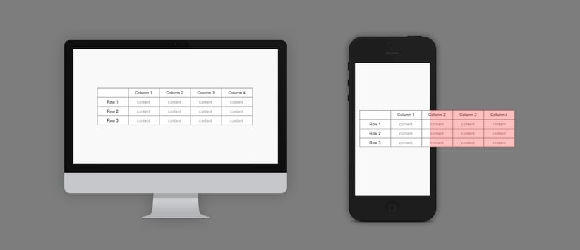
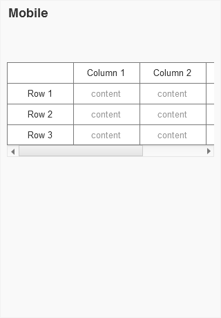
Another solution (among those simpler ones) is to build a table scrolled horizontally. When the screen resolution becomes smaller than the width of the table, it is closed in a container forming a mask that doesn’t allow the table to go beyond the page limits. Inside the container, tables can be easily scrolled horizontally.
This solution keeps the user on the page and is fairly easy to implement. However, a user may not realize that the table is scrollable, besides it is impossible to see the entire table at once. This way of browsing the tables can be expanded by another convenience for a user, e.g. blocked first column, which allows to have a continuous overview of the most important data.
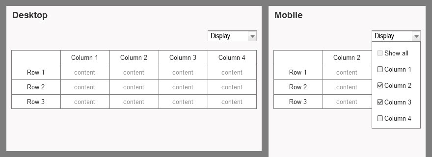
A table with selection
Another option is to create a table with data selection option. If the resolution is too small to display a full-sized table, users are able to choose the data they want to see. Depending on the information contained in the table, it’s grouped together and a user can choose which one to see. However, you should consider giving a user the ability to view all the information and how to present a table in such a situation. One possibility is to provide restricted choice, e.g. up to three columns, but you need to bear in mind that it will hinder a user from a convenient comparison of all the information.
Not only tables
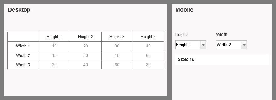
Some variation of such a selective presentation of data is moving away from creating a table (if the contained information and data permit it) and creating a tool for searching specific cells by a user.
The execution of this method depends largely on the type of data a table contains. If it’s a data arrangement from which the user needs only specific information, e.g. size X dependent on width Y and height Z, then the choice may be limited to those categories (width and height), resulting in size X.
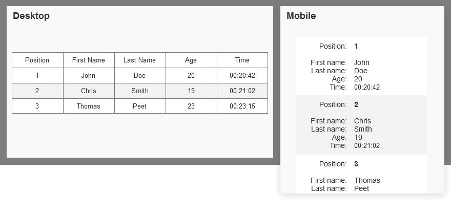
If no other solution works, you can still consider converting the table to data blocks. Below a certain resolution, all information associated with each cell are combined into one. As a result, we can get very long arrangement that’s hard to compare with each other. A search engine or filtering function can prove useful in such situation.
Published September 16, 2015


